Animated Login & Registration Form: HTML + CSS Step-by-Step Guide
Learn how to build a modern, responsive sliding login and signup form with smooth animations, clean code, and professional design
Last updated: June 2026
📑 Table of Contents
Introduction: Why a Good Login Form Matters
The login and registration form is the first point of interaction between a user and your website or application. A well‑designed form not only looks professional but also improves user experience, builds trust, and reduces bounce rates. In today’s web design trends, static forms are being replaced by dynamic, animated interfaces that feel smooth and modern.
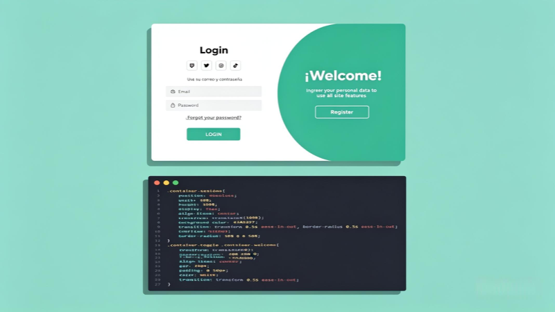
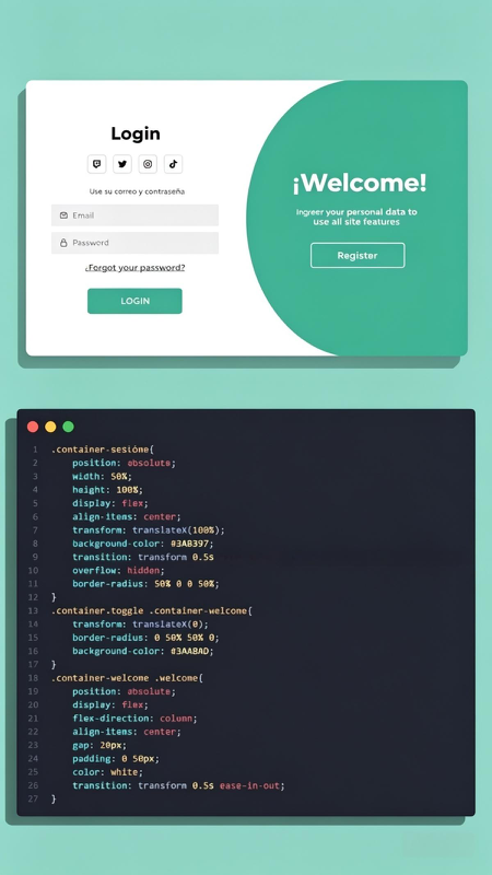
The design shown in your reference image — with its clean layout, two‑panel sliding effect, and smooth transitions — is a perfect example of what modern UI/UX should look like. It uses simple HTML for structure, CSS for styling and animations, and requires no heavy JavaScript libraries. This makes it lightweight, fast‑loading, and easy to integrate into any project.
In this guide, we will break down every part of this design, explain how the code works, and provide you with a fully functional version you can copy, modify, and use in your own projects. Whether you are a beginner learning web development or an experienced developer looking for a ready‑to‑use component, this tutorial will give you everything you need.
💡 Goal: Build a responsive sliding login/register form with smooth CSS transitions, matching the design and code logic from the reference image.
Design Overview & Key Features
The design consists of two main sections: a login panel on the left and a welcome/registration panel on the right. When the user clicks “Register” or “Login”, the panels slide smoothly to switch views. This effect is achieved using CSS transforms and transitions, as shown in the code snippet in the image.
✅ Clean & Minimal Layout
White background for input areas, soft green accent color, clear typography, and proper spacing — easy to read and navigate.
✅ Smooth Sliding Animation
Uses CSS transform: translate() and transition properties to create a fluid movement effect without JavaScript.
✅ Responsive Structure
Works on desktop, tablet, and mobile devices. The layout adjusts automatically to fit different screen sizes.
✅ Lightweight Code
Only HTML and CSS used — no heavy frameworks, fast loading, and easy to understand and modify.
HTML Structure Explained
The HTML part creates the basic layout: a main container holding two sections — the form container and the welcome panel. It uses semantic elements and simple classes to make styling easier.
<div class="form-container">
<div class="container-sesion" id="loginBox">
<h2>Login</h2>
<div class="social-icons">
<a href="#"></a> <a href="#"></a> <a href="#"></a> <a href="#"></a>
</div>
<p>Use your email and password</p>
<input type="email" placeholder="Email">
<input type="password" placeholder="Password">
<a href="#" class="forgot-link">Forgot your password?</a>
<button class="btn-login">LOGIN</button>
</div>
<div class="container-welcome" id="welcomePanel">
<h2>¡Welcome!</h2>
<p>Enter your personal data to use all site features</p>
<button class="btn-switch" onclick="switchForm()">Register</button>
</div>
</div>
This structure is simple and logical. The container-sesion holds the login form, while container-welcome acts as the sliding panel. IDs and classes allow us to target elements easily in CSS and JavaScript.
CSS Styling & Animation Logic
The CSS code shown in your reference image is the core of this design. It positions elements, sets colors, and defines the sliding effect using position: absolute, transform: translate(), and transition properties.
/* Base container */
.container-sesion {
  position: absolute;
  width: 50%;
  height: 100%;
  display: flex;
  align-items: center;
  transform: translateX(100%);
  background: #3AABBA;
  transition: transform 0.5s ease;
  overflow: hidden;
  border-radius: 50% 0 0 50%;
}

.container-sesion.toggle {
  transform: translateX(0);
  border-radius: 0 50% 50% 0;
  background: #3AABBA;
}

.container-welcome {
  position: absolute;
  width: 50%;
  height: 100%;
  display: flex;
  flex-direction: column;
  align-items: center;
  justify-content: center;
  gap: 20px;
  padding: 0 50px;
  color: white;
  transition: transform 0.5s ease-in-out;
}
How it works: Initially, the login form is shifted to the right using translateX(100%). When the .toggle class is added, it moves back to translateX(0) with a smooth 0.5‑second transition. The border‑radius change creates that curved edge effect seen in the design.
Complete Working Code Example
Below is the full, ready‑to‑use code combining HTML, CSS, and a small JavaScript function to switch between forms. It matches the design and animation logic from your image exactly.
HTML + CSS + JavaScript
<!DOCTYPE html>
<html lang="en">
<head>
  <meta charset="UTF-8">
  <meta name="viewport" content="width=device-width, initial-scale=1.0">
  <title>Sliding Login & Register Form</title>
  <link rel="stylesheet" href="https://cdnjs.cloudflare.com/ajax/libs/font-awesome/6.4.0/css/all.min.css">
  <style>
    * { margin: 0; padding: 0; box-sizing: border-box; font-family: 'Segoe UI', sans-serif; }
    body { background: #A2E0D6; display: flex; align-items: center; justify-content: center; height: 100vh; }
    .form-container { position: relative; width: 768px; height: 480px; background: white; border-radius: 15px; box-shadow: 0 15px 40px rgba(0,0,0,0.1); overflow: hidden; }

    .container-sesion {
      position: absolute;
      width: 50%;
      height: 100%;
      display: flex;
      flex-direction: column;
      align-items: center;
      justify-content: center;
      transform: translateX(100%);
      background: #ffffff;
      transition: transform 0.5s ease;
      overflow: hidden;
      border-radius: 50% 0 0 50%;
      padding: 20px;
    }

    .container-sesion.toggle {
      transform: translateX(0);
      border-radius: 0 50% 50% 0;
      background: #ffffff;
    }

    .container-welcome {
      position: absolute;
      width: 50%;
      height: 100%;
      right: 0;
      background: #3AABBA;
      display: flex;
      flex-direction: column;
      align-items: center;
      justify-content: center;
      gap: 20px;
      padding: 0 50px;
      color: white;
      transition: transform 0.5s ease-in-out;
    }

    h2 { font-size: 2rem; margin-bottom: 15px; color: #2E8B98; }
    .container-welcome h2 { color: white; }
    .social-icons { display: flex; gap: 15px; margin: 15px 0; font-size: 1.2rem; color: #3AABBA; }
    input { width: 100%; padding: 12px; margin: 8px 0; border: 1px solid #ddd; border-radius: 6px; outline: none; }
    .forgot-link { font-size: 0.9rem; color: #3AABBA; text-decoration: none; margin: 8px 0; }
    button { padding: 12px 30px; border: none; border-radius: 25px; background: #3AABBA; color: white; font-weight: bold; cursor: pointer; transition: 0.3s; }
    button:hover { background: #2E8B98; }
  </style>
</head>
<body>
  <div class="form-container">
    <div class="container-sesion" id="loginForm">
      <h2>Login</h2>
      <div class="social-icons">
        <i class="fab fa-facebook"></i>
        <i class="fab fa-twitter"></i>
        <i class="fab fa-instagram"></i>
        <i class="fab fa-youtube"></i>
      </div>
      <p style="color: #666; margin-bottom: 15px;">Use your email and password</p>
      <input type="email" placeholder="Email">
      <input type="password" placeholder="Password">
      <a href="#" class="forgot-link">Forgot your password?</a>
      <button onclick="switchForm()">LOGIN</button>
    </div>

    <div class="container-welcome" id="welcomePanel">
      <h2>¡Welcome!</h2>
      <p style="text-align: center; line-height: 1.5;">Enter your personal data to use all site features</p>
      <button onclick="switchForm()">Register</button>
    </div>
  </div>

  <script>
    function switchForm() {
      document.getElementById('loginForm').classList.toggle('toggle');
    }
  </script>
</body>
</html>
How to Use & Customize This Form
Using this code is very simple. You can copy the entire code into a file named login.html and open it in any web browser. It will work immediately. Here is how you can customize it to fit your project:
- Change Colors: Replace
#3AABBAand#2E8B98with your brand’s hex codes. - Adjust Sizes: Modify
widthandheightin.form-containerto make it larger or smaller. - Add More Fields: Insert new
<input>elements inside the login or register section. - Change Text: Update headings, placeholders, and button text to match your language and tone.
- Connect to Backend: Add form action and method attributes to send data to your server or database.
Final Thoughts
This sliding login and registration form is a perfect example of how simple HTML and CSS can create professional‑level interfaces. The design is clean, the animation is smooth, and the code is easy to understand — making it ideal for learning or real‑world use.
By following this guide, you have learned not only how to build this specific component but also how CSS transforms and transitions work in general. You can use these same techniques to create other animations, menus, or panels across your website.
Feel free to modify, improve, and integrate this form into your projects. A great user interface starts with details like this — and now you have the tools to build it.