Introduction: Why the Sunset Color Palette Stands Out
There is a natural beauty that captures attention instantly: the warm, glowing colors of a sunset. As the sun dips below the horizon, it paints the sky in a smooth transition from deep fiery orange to bright golden yellow, finally fading into soft cream light. This visual harmony is not only pleasing to the eye but also one of the most effective color combinations you can use in modern design.
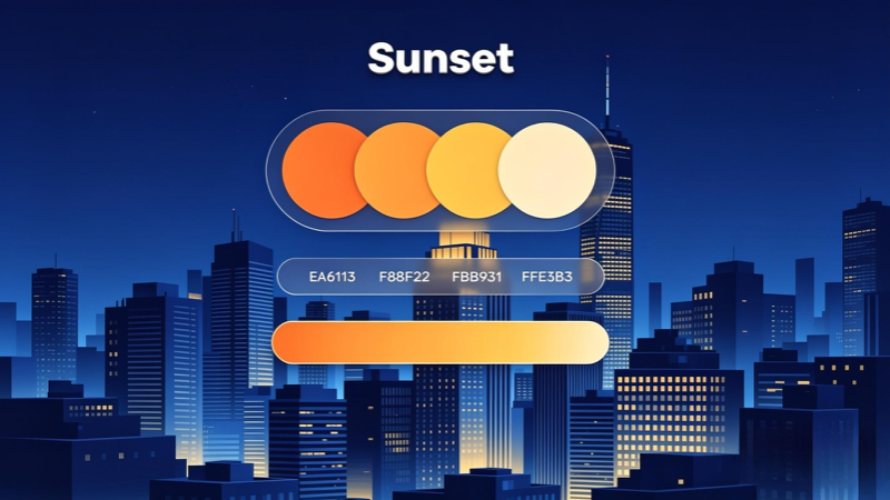
The Sunset Color Palette featured here brings this natural magic into your digital work. It consists of four carefully selected shades: #EA6113 (Deep Sunset Orange), #F88F22 (Bright Tangerine), #FBB931 (Golden Yellow), and #FFE3B3 (Soft Cream Glow). When combined, they create a seamless gradient that feels energetic, warm, and balanced — especially when set against a dark background like the night‑city skyline shown in the reference design.
Whether you are building a website, designing social media graphics, creating branding materials, or coding user interfaces, this palette offers versatility and strong visual impact. It conveys feelings of optimism, creativity, and warmth while maintaining high contrast and readability. In this guide, we will break down every detail — from exact color codes and psychological meaning to practical examples and CSS implementation — so you can start using this beautiful scheme right away.
🎨 Key Takeaway: Sunset colors work because they follow nature’s own flow — creating a smooth, eye‑catching transition that feels familiar yet modern.
Sunset Color Palette: Hex Codes, Usage & Design Guide
Discover the warm, vibrant Sunset color scheme — hex codes, meaning, examples, and how to use this gradient in web design, graphics, and branding
Last updated: June 2026
📑 Table of Contents
Introduction: Why Sunset Color Palettes Are So Popular
There is something universally appealing about the colors of a sunset — the deep warm oranges, glowing golds, and soft creamy yellows that paint the sky as day turns to night. This natural gradient is not just beautiful to look at; it is also one of the most effective color combinations you can use in design.
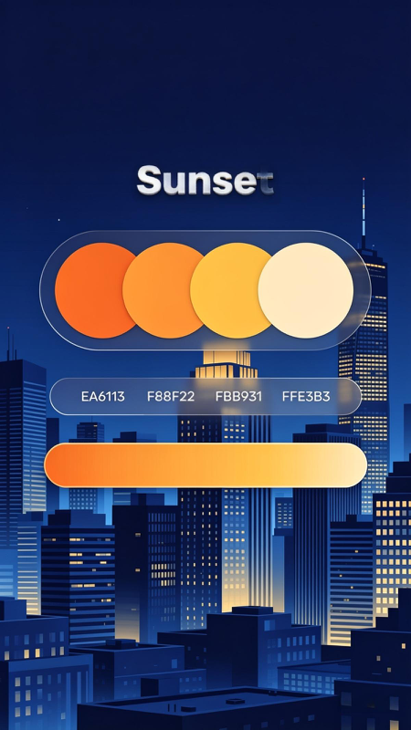
The Sunset Color Palette shown in your reference image captures this exact transition: starting from rich orange #EA6113, moving through bright tangerine #F88F22, sunny yellow #FBB931, and finishing with soft cream #FFE3B3. Paired against a deep city‑night blue background, this set creates high contrast, depth, and a premium modern feel.
In this guide, we will break down every detail: exact hex codes, what each color communicates, how to build gradients, and how to apply this palette to websites, logos, posters, and social media content. Whether you are a web developer, graphic designer, or blogger, this is a complete resource you can use immediately.
🎨 Key Benefit: Sunset colors feel energetic yet warm, attracting attention without being harsh or overwhelming to the eye.
Full Sunset Palette: Hex & RGB Codes
Below are the exact values from the design, ready to copy and use in any design software or code editor. These are standard web‑safe values that work across all browsers and devices.
Complete Sunset Gradient
linear-gradient(90deg, #EA6113, #F88F22, #FBB931, #FFE3B3)
Color Psychology & Emotional Meaning
Every color sends a message. Understanding what this palette communicates helps you choose when and where to use it effectively.
Deep Orange (#EA6113)
Represents energy, passion, excitement, and urgency. Perfect for call‑to‑action buttons, headlines, and elements you want users to notice first.
Tangerine (#F88F22)
Stands for creativity, warmth, and friendliness. It feels less aggressive than pure red, making it great for branding and interface accents.
Golden Yellow (#FBB931)
Symbolizes optimism, joy, attention, and positivity. It draws the eye and gives a premium, vibrant feeling without being harsh.
Cream (#FFE3B3)
Brings calmness, clarity, and softness. Ideal for backgrounds, text highlights, or areas where you want to reduce visual weight.
Combined, they create a mood of progress, warmth, and energy — exactly why this palette works so well against dark backgrounds like the night‑city scene in your image. It feels modern, professional, and inviting at the same time.
Real‑World Design Examples
Here is how you can apply this sunset color scheme across different types of projects:
🌐 Web Design
- Gradients for headers, buttons, and navigation bars
- Dark blue background + sunset text for high readability
- Use
#EA6113for “Buy Now” or “Read More” buttons - Great for travel, lifestyle, fitness, and tech blogs
📱 Social Media & Graphics
- Instagram posts, YouTube thumbnails, and posters
- Gradient overlays on photos for a warm artistic look
- Perfect for content about motivation, travel, and food
- Stands out clearly in busy feeds
🏷️ Branding & Logos
- Modern, energetic brand identity
- Works well for startups, outdoor brands, and apps
- Easy to reproduce in print and digital formats
📊 Data Visualization
- Use as a sequential scale for charts and graphs
- Darkest shade = highest value, lightest = lowest
- Improves readability and visual hierarchy
How to Use in HTML & CSS
Below are practical code examples to add this sunset color scheme and gradient to your website. All code is clean, responsive, and follows modern web standards.
1. Solid Colors Usage
/* Solid colors */
.dark-orange { color: #EA6113; }
.tangerine { color: #F88F22; }
.gold-yellow { color: #FBB931; }
.cream { color: #FFE3B3; }

/* Backgrounds */
.bg-sunset-1 { background-color: #EA6113; }
.bg-sunset-2 { background-color: #F88F22; }
.bg-sunset-3 { background-color: #FBB931; }
.bg-sunset-4 { background-color: #FFE3B3; }
2. Sunset Gradient Example
/* Horizontal Sunset Gradient */
.sunset-gradient {
  background: linear-gradient(90deg, #EA6113, #F88F22, #FBB931, #FFE3B3);
  border-radius: 25px;
  height: 50px;
  width: 100%;
}

/* Vertical Sunset Gradient */
.sunset-gradient-v {
  background: linear-gradient(180deg, #EA6113, #F88F22, #FBB931, #FFE3B3);
}
3. Button Example
<style>
.sunset-button {
  padding: 12px 30px;
  border: none;
  border-radius: 25px;
  background: linear-gradient(90deg, #EA6113, #F88F22, #FBB931);
  color: #1a202c;
  font-weight: bold;
  font-size: 1.05rem;
  cursor: pointer;
  transition: transform 0.2s ease;
}
.sunset-button:hover {
  transform: scale(1.03);
}
</style>

<button class="sunset-button">Get Started</button>
Pro Tips & Best Color Combinations
To get the best results, pair this palette with complementary colors that create balance and readability.
✅ Best Matching Colors
- Deep Navy Blue (#0F2540): High contrast, exactly like the city background in your design — gives a premium, modern feel.
- Charcoal Gray (#2D3748): Neutral, professional, keeps focus on the sunset elements.
- White & Light Gray (#F8FAFC): Ensures text is readable and keeps the design clean.
- Muted Teal (#2C7A7B): Adds a cool‑toned balance to the warm oranges.
✅ Accessibility Tips
- Use
#EA6113text only on light backgrounds; use#FFE3B3text on dark backgrounds. - Check contrast ratio: aim for at least 4.5:1 for body text.
- Avoid placing light yellow text on white — it becomes hard to read.
Final Thoughts
The Sunset color palette is more than just a set of pretty colors — it is a complete design system that works across almost every type of digital project. From the deep orange #EA6113 to the soft cream #FFE3B3, this gradient brings natural beauty, energy, and warmth to your work.
As you have seen, it is easy to use: copy the hex codes, build gradients in CSS, and pair them with dark neutrals for maximum impact. Whether you are designing a new website, creating social media content, or building a brand identity, this palette will help you create visuals that feel vibrant, professional, and memorable.
Save this guide for future reference — and start bringing that beautiful sunset glow into your designs today.